Data Interpretation :: Line charts
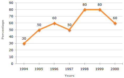
The following line graph gives the percentage of the number of candidates who qualified an examination out of the total number of candidates who appeared for the examination over a period of seven years from 1994 to 2000.
Percentage of Candidates Qualified to Appeared in an Examination Over the Years
-
The difference between the percentage of candidates qualified to appeared was maximum in which of the following pairs of years?
-
In which pair of years was the number of candidates qualified, the same?
-
If the number of candidates qualified in 1998 was 21200, what was the number of candidates appeared in 1998?
-
If the total number of candidates appeared in 1996 and 1997 together was 47400, then the total number of candidates qualified in these two years together was?
-
The total number of candidates qualified in 1999 and 2000 together was 33500 and the number of candidates appeared in 1999 was 26500. What was the number of candidates in 2000?

 Whatsapp
 Facebook


 x =
x = Number of candidates qualified in 2000 = (33500 - 21200) = 12300.